Challenge
Create a web app to help Technical Account Managers (TAMs) visualize data and manage accounts efficiently.
My role
As a user experience designer, I was responsible for implementing data visualization principles to make the interface more user-friendly for the TAM. Additionally, I had the opportunity to create a naming convention for different frames and components to reduce the time designers spent making changes on the Design System Language (DSL). Also, I worked with the UX lead to manage the DSL for the web app and ensure version control.
Objective
My primary objective was to provide the TAMs with a suitable data visualization element to easily identify the accounts that have credits nearing expiration. Additionally, I aimed to assist the users in creating plans that encourage accounts with a substantial amount of credits.
Method Used
Discovery
During the discovery phase of this project, the focus was on understanding the problem at hand and gathering relevant information. This involved conducting research, gathering user insights, and analyzing existing data. The goal was to gain a deep understanding of the needs and pain points of the users, as well as the objectives of the project. Through interviews, surveys, and user testing, valuable insights were collected, which helped shape the direction of the design process. The discovery phase laid the foundation for making informed decisions and ensuring that the final solution addressed the specific challenges identified during this initial stage.
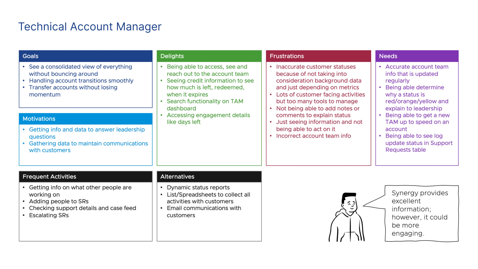
After a round of interviews, the UX Researcher helped the team to synthesize all the data in a Persona artifact. With the different personas, it was easy for us to steer our designs to solve the different pain points of each Persona that was the user from our solutions.
Design
Based on the insights gathered from the persona analysis and interviews conducted by the Researcher, I decided to focus on improving the application's dashboard design. The priority was set on simplifying the design and enhancing the data visualization to provide a better user experience.
Due the quick timing of the design sprint I began to built quick mockups based on the Design System Language Clarity. This saved me a lot of time on designing, however I had to save time to learn the boundaries and possibilities for this DSL.
Given the tight timeline of the design sprint, I opted to swiftly construct mockups using the Clarity Design System Language. This decision proved to be a wise one as it enabled me to save a considerable amount of time on the designing phase. However, in order to effectively leverage this approach, I had to invest some time in getting acquainted with the boundaries and possibilities of the DSL.
Final Solution
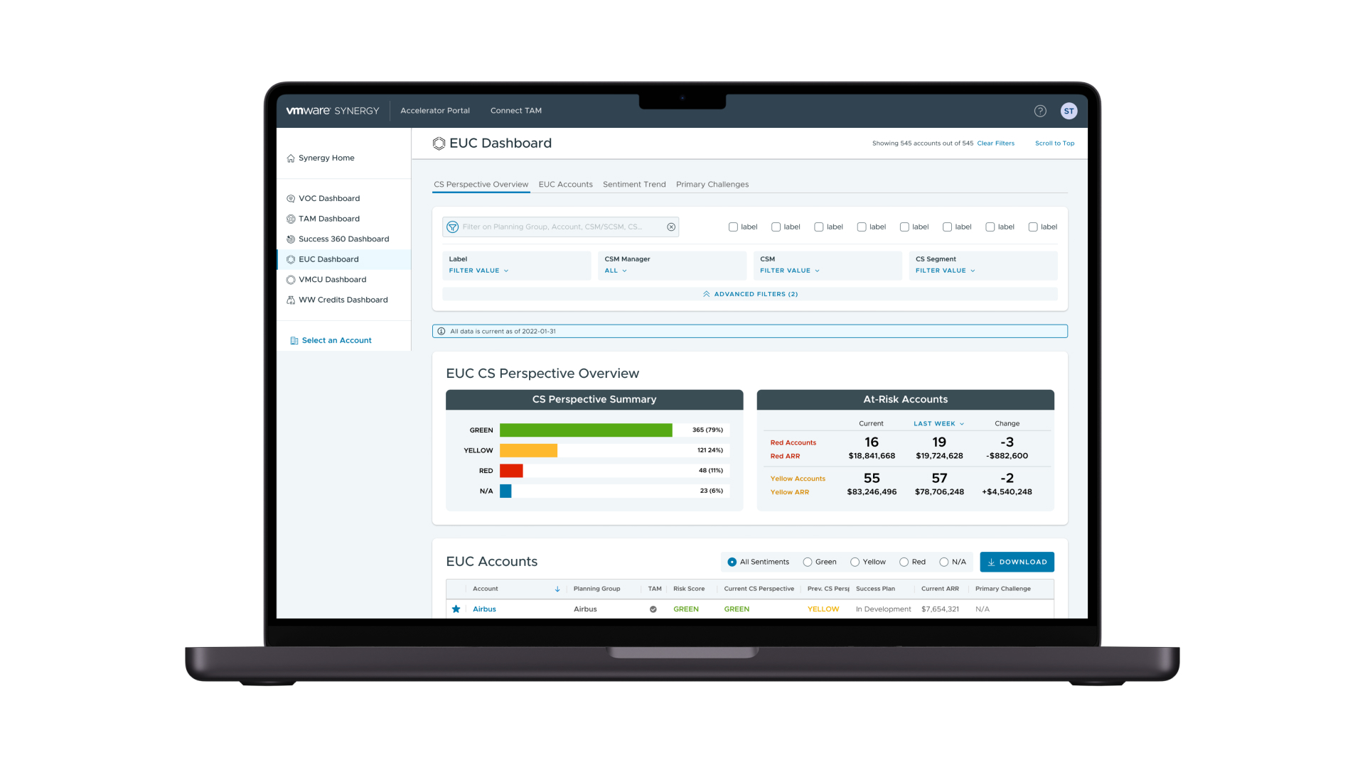
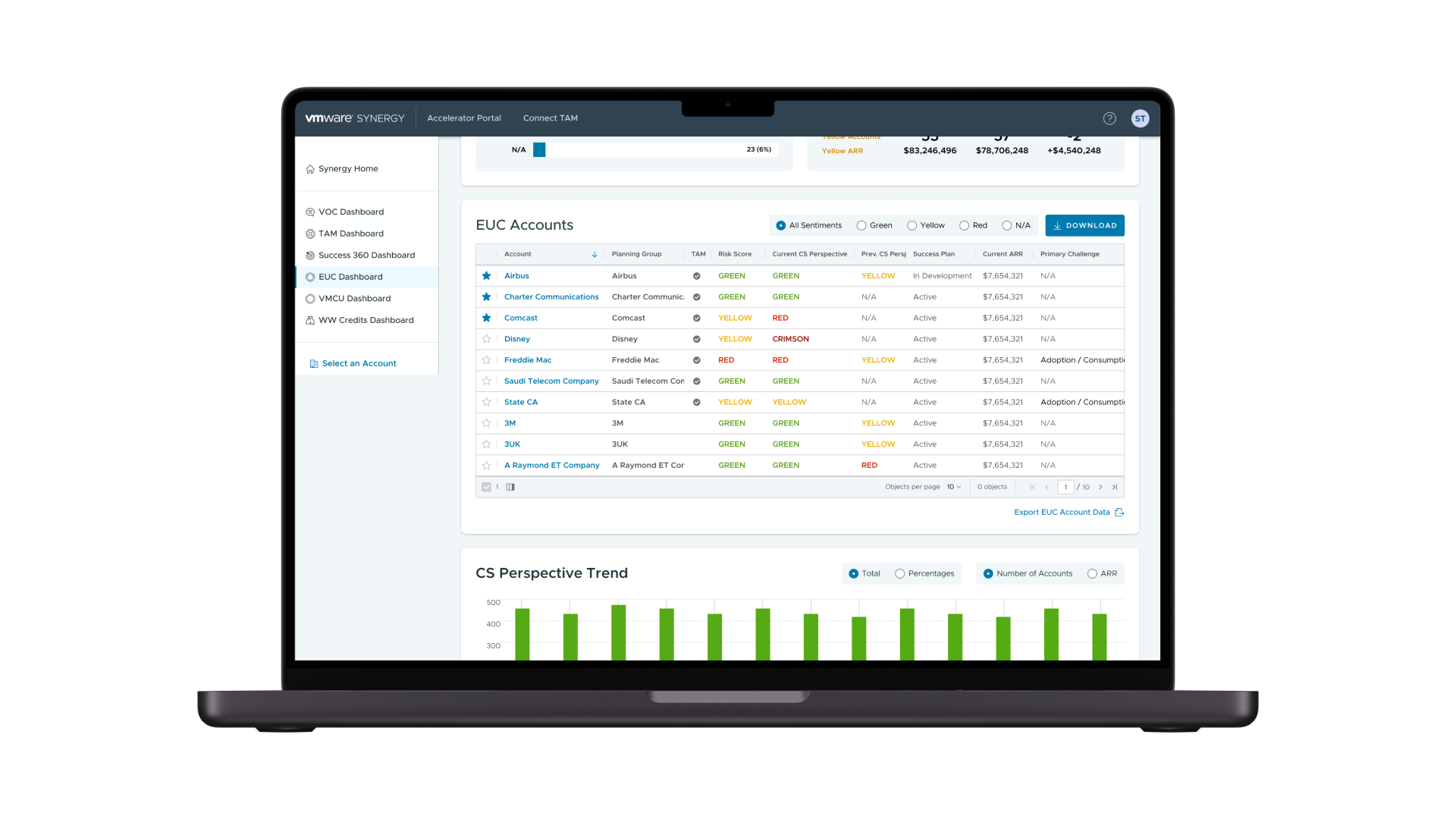
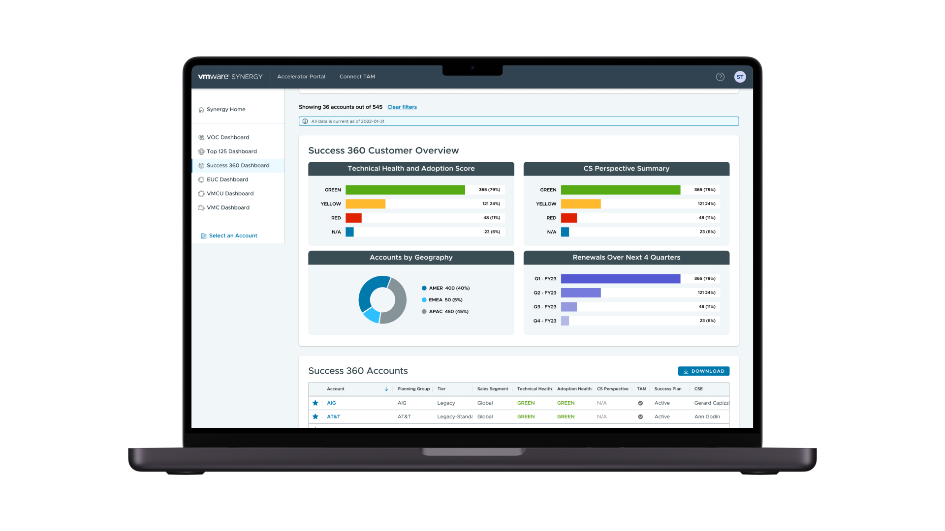
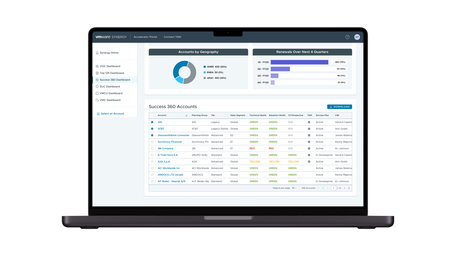
I have created a series of mockups for the web app that I built. These mockups showcase the user interface and visual design of the app, demonstrating how the data visualization principles were implemented to make it more user-friendly for Technical Account Managers (TAMs). The mockups highlight the naming convention for different frames and components, as well as the design system language (DSL) that was used to ensure consistency and version control. Through these mockups, you can get a clear understanding of how the final solution addresses the objective of providing TAMs with a suitable data visualization element to manage accounts efficiently.
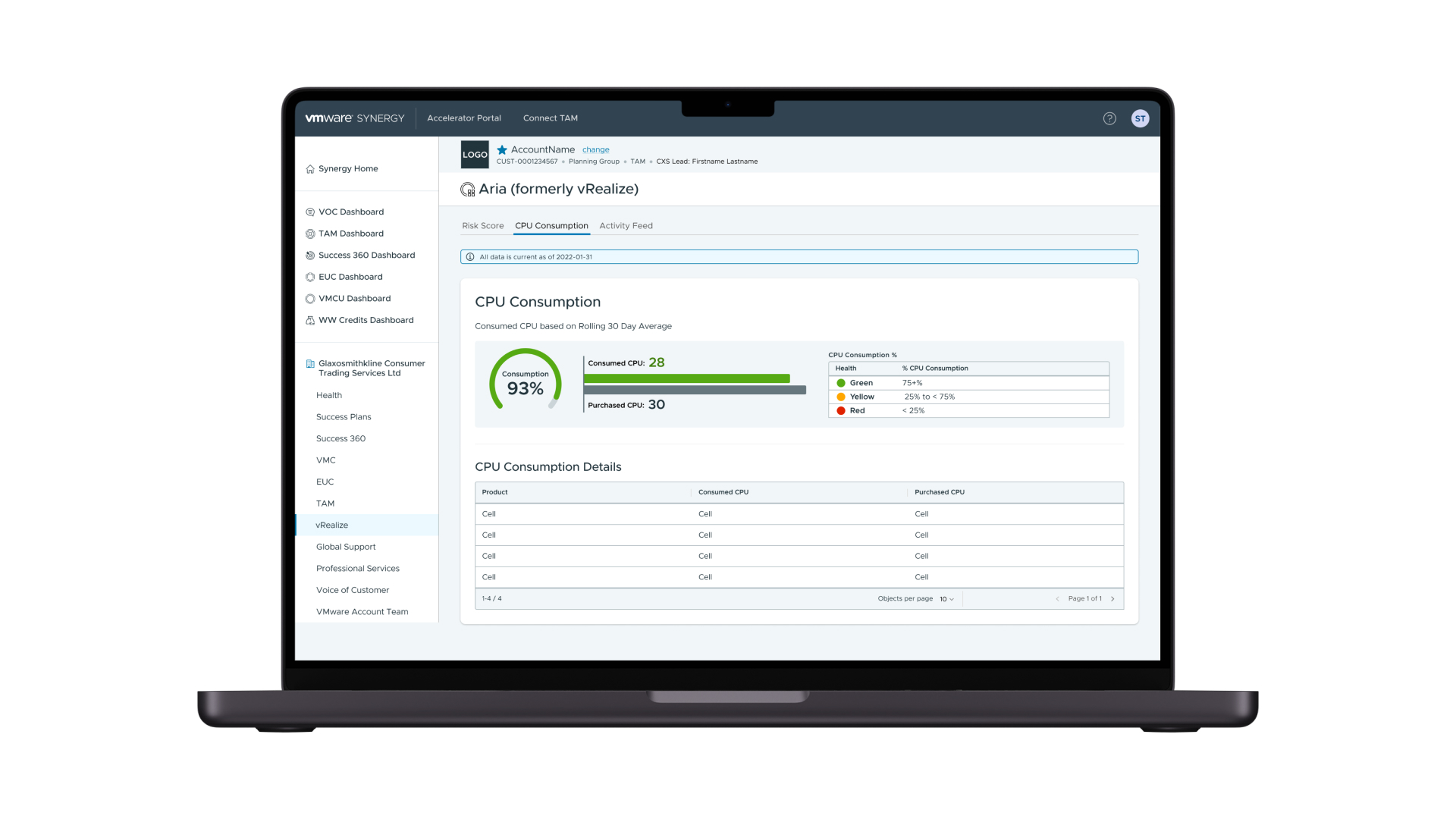
CPU Consumption was a dashboard that included a comparison between the credits consumed vs the purchased amount.
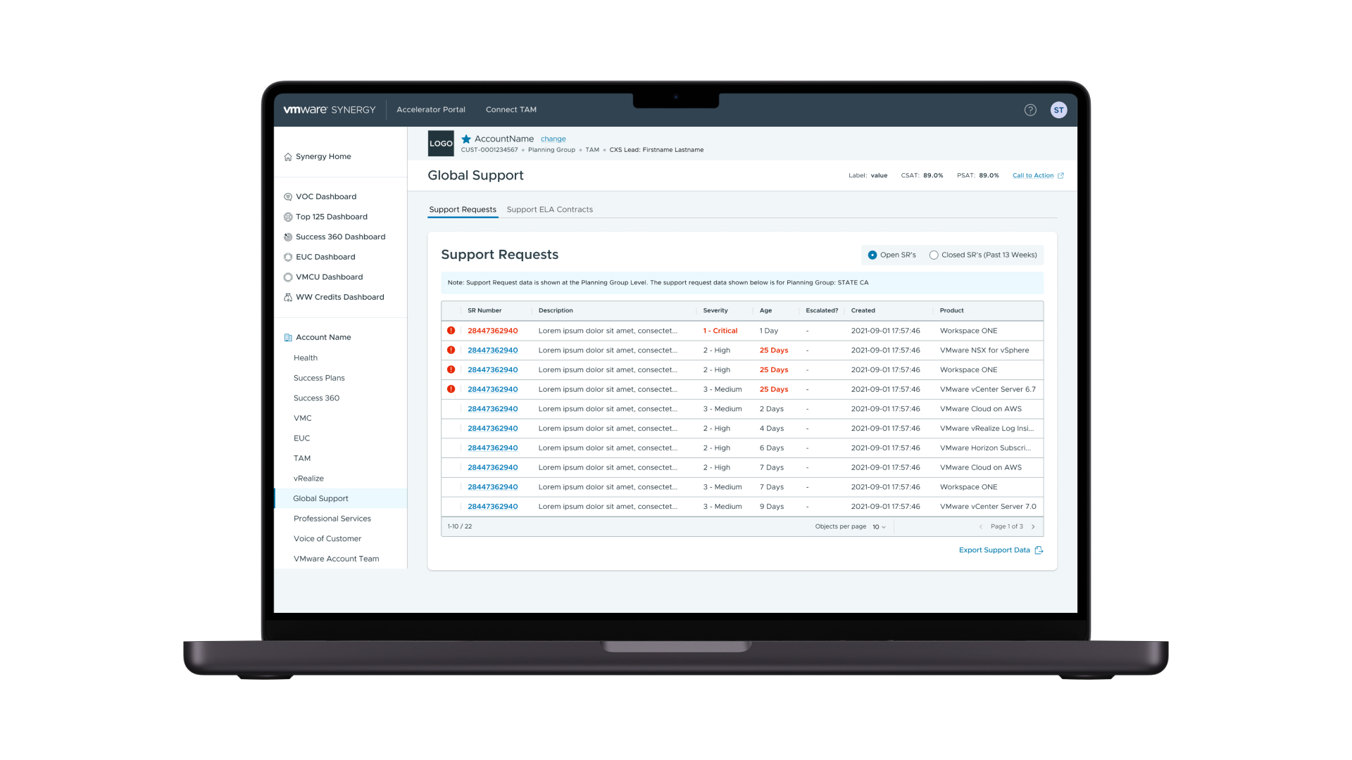
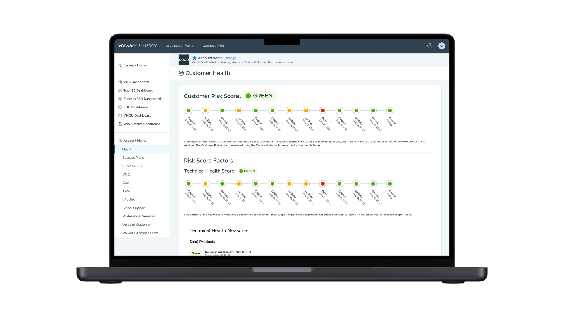
For the different tables used in the application there was high important information that should be shown in order to help the TAM take action swiftly.
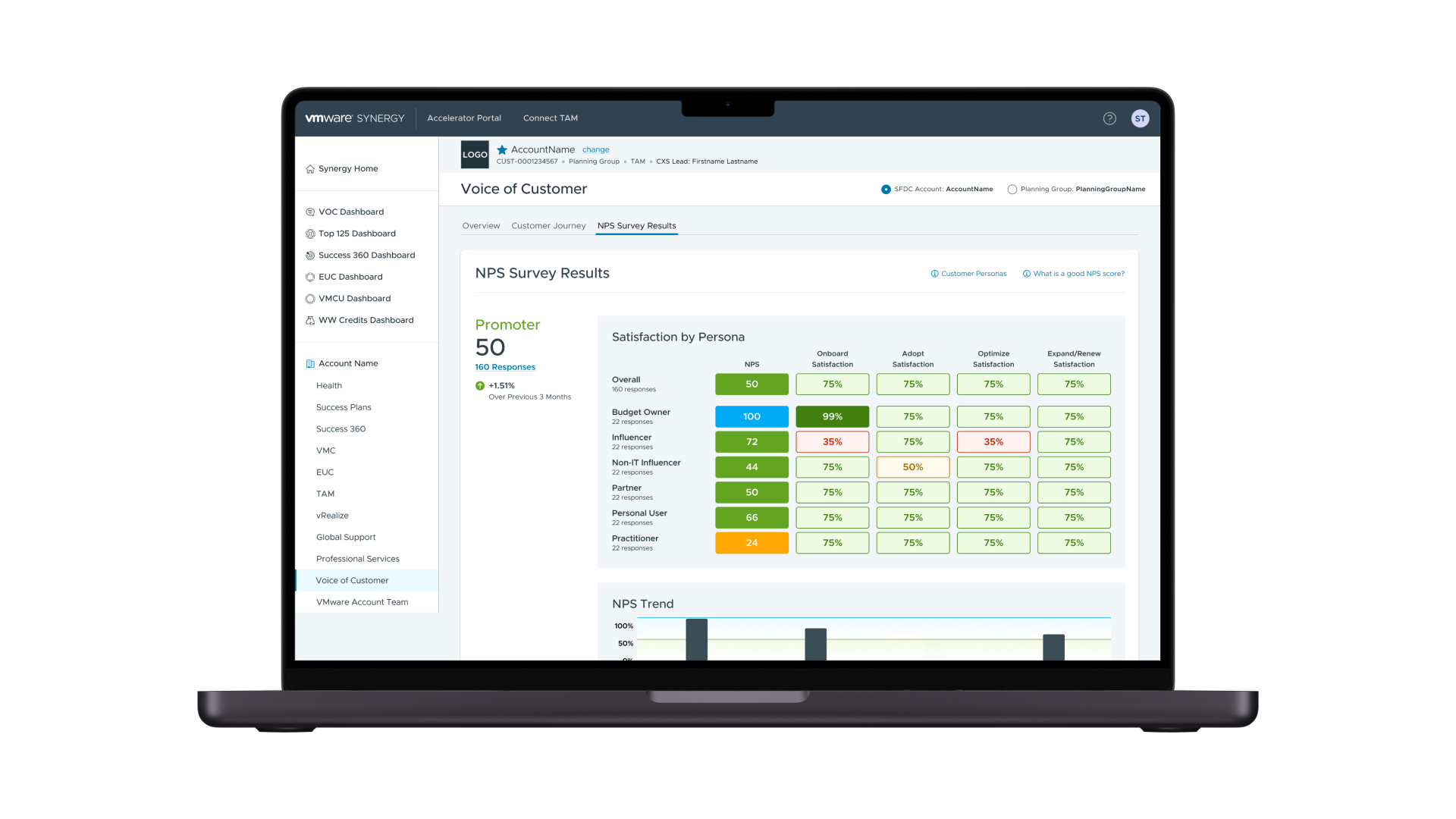
The web app showed a Net Promoter Score that help the TAM identify key stakeholders on the account and the score this persona gave to the services.
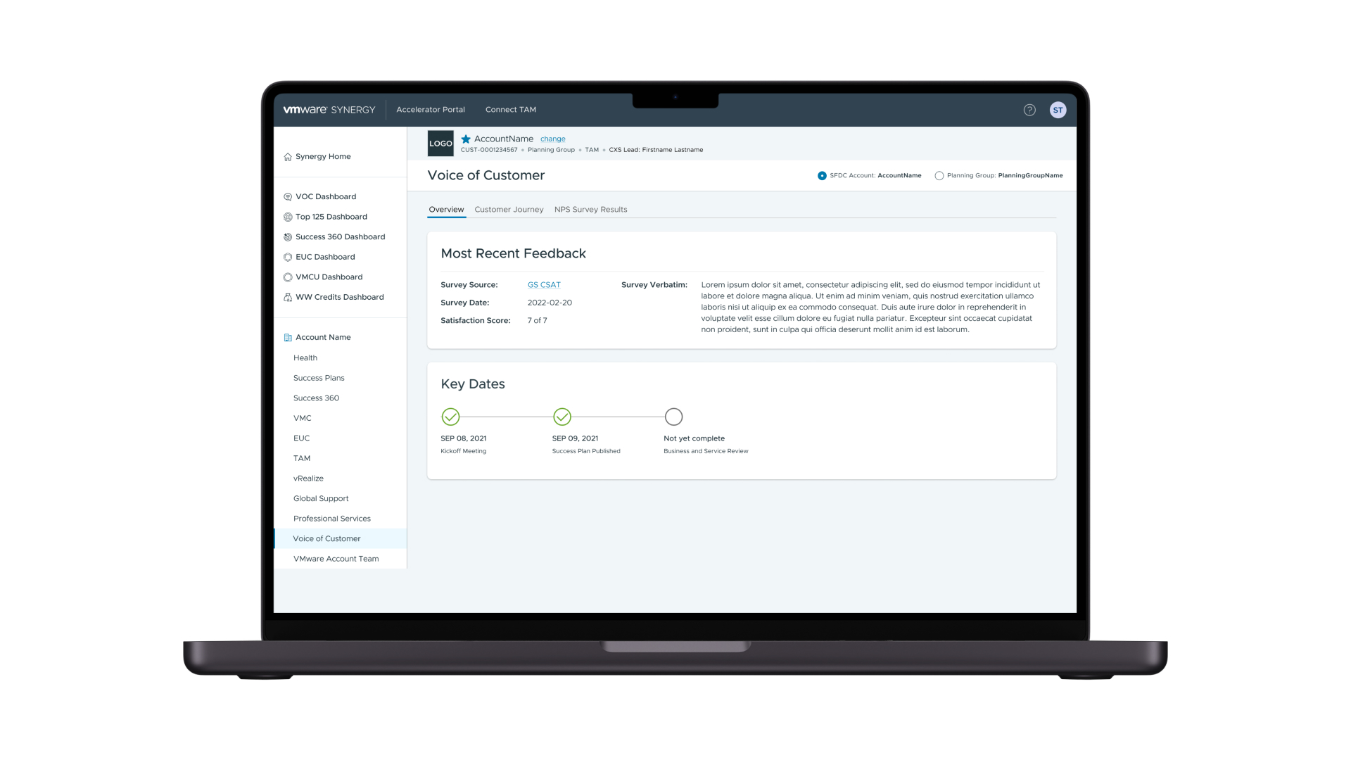
Also, the Voice of Customer section had a stepper on it that helped identify milestones in the plan for the account.
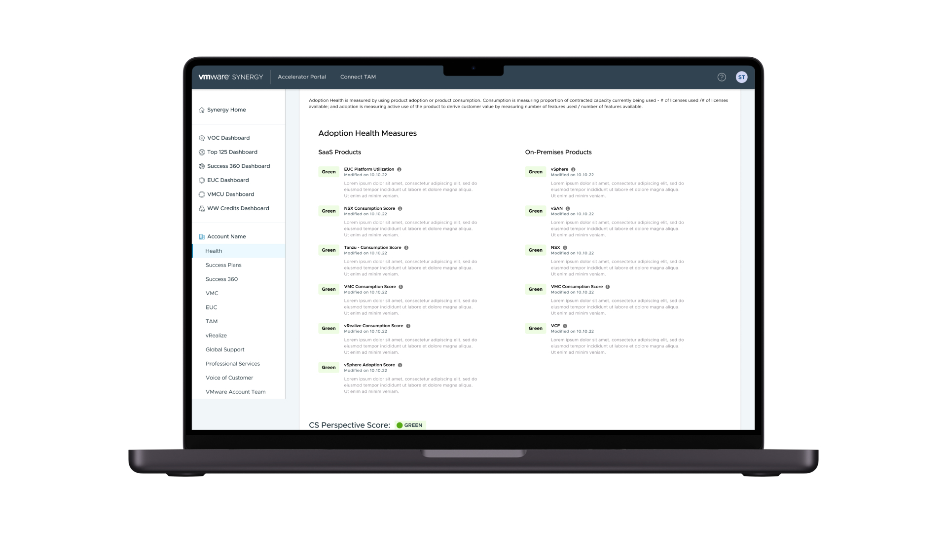
The information showed in the dashboards was important to make a quick comparison between the different services in each account. Know the status for SaaS and On Premises products was important for the TAMs.
Takeaways
- I had the opportunity to work with the Design System Language from VMWare called Clarity. This DSL was very robust and had a quite complex way to use some elements on the screens. With time, I became an expert in selecting the different components and creating suitable screens for the project.
- I also enhance my skills in data visualization and how to show better graphs that give more insights to the user. I was working on a client-facing website where I put into practice my skills in a challenging project, and here, I had the opportunity to reinforce that knowledge.
- I was given the chance to establish a naming convention for the frames in all of our designs. This solution proved to be very helpful for the development team as it allowed them to quickly understand the different elements and create the screen layouts more efficiently. To achieve this, I simply used the same names that were used in the HTML to label my layers, which improved the level of communication with the dev team.
Overview
- Category Enterprise App
- Client VMWare
- Time 4 months
- Tools Figma & Jira