Challenge
The challenge was to manage the number of requirements from the client when we showed new designs to the stakeholders. Neighborly is a company that holds more than twenty brands focusing on household services. Our main effort was to create a library and components that we could use to replicate the designs on each brand, however each brand had its own Brand President and Marketing Executives.
My Role
My responsibility in this project was to define the strategy and maintenance for the Design System Language used in this solution. Also, I worked on the designs for mobile and led the effort for the final designs.
Objective
During the project, I worked on defining the UX strategy that was implemented. I collaborated closely with the client to establish the Key Performance Indicators (KPIs) that were necessary to measure the project's success. Additionally, I worked on the strategy related to managing the Design System Language (DSL) that would be used in the final solution. For this purpose, I scheduled a calendar to help decide the best day to make releases on the DSL to ensure that other designers could work collaboratively without any obstacles.
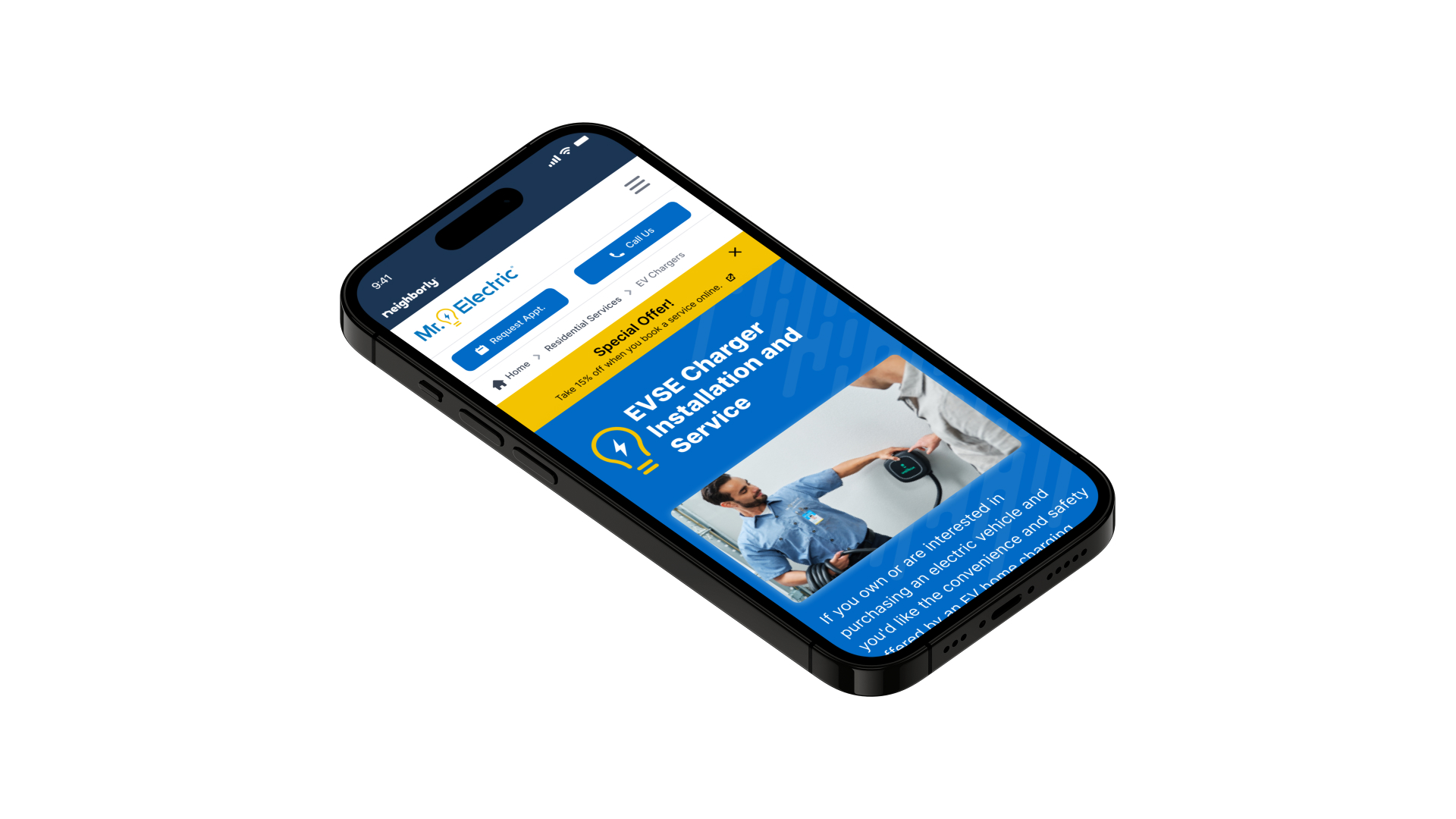
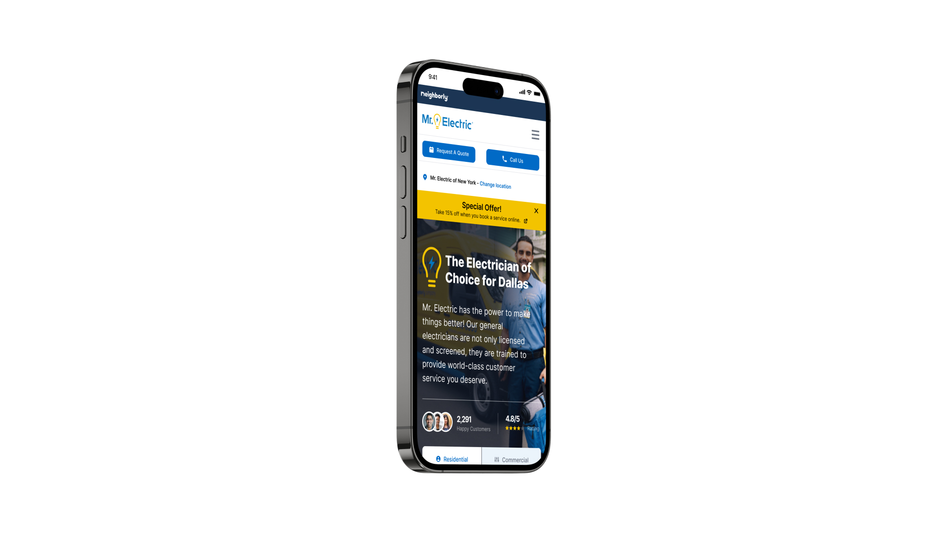
During my tenure, I collaborated with a co-worker on revamping the branding of MRE, a brand that served as the initial attempt to replicate the new DSL for the company. As a mobile designer, I was responsible for leading the design aspect of this effort. The client required us to follow a mobile-first approach, so I oversaw the design decisions in this area. To ensure that the client and stakeholders understood our design choices, we created highly detailed prototypes.
Method Used
Discovery
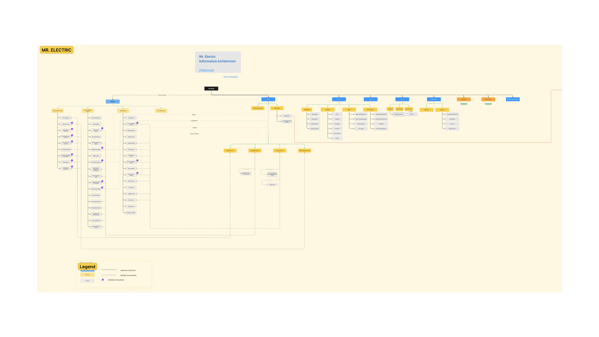
During the Discovery phase of the project, the team conducted an analysis of the information architecture of various Neighborly brands. The primary goal was to gain a better understanding of the different levels of stacking and identify potential overlaps.
With that done, it was easy to create a suitable UI Kit that could be scalable to all brands and maintain standardization on all the information architectures. Even though we work on this standardization we kept a level of personalization for each brand.
Based on the available information, I created a persona artifact. This helped me focus on identifying the elements causing frustrations and pain points on the sites.
Tom is the user that always is busy finishing those projects in his house; that's the primary reason he looks for a company he can rely on to make those updates, tweaks, or solve his house's problems. Tom is willing to pay more to get a certified expert and avoid dealing with back and forths on the quote and get a good quality job.

Design
At the beginning of each sprint, we divide tasks among the team members to ensure timely completion. During one such sprint, I undertook the responsibility of creating mobile designs for the re-skinning of Neighborly's brands. I identified all the essential components that needed to be incorporated into the Design System Language, which was then used to develop a UI Kit. This kit enabled us to replicate the layouts for other brands in Neighborly's portfolio.
During the project, the team utilized a comprehensive review process in collaboration with the client. The review process proved to be an invaluable tool in keeping track of important insights and agreements, as well as ensuring that all screens were reviewed and approved in order to progress with the project's various outcomes.
I would like to bring attention to the creation and management of the DSL, which was a significant effort on my part. The client had provided a framework, and I developed a DSL that could be utilized by the rest of the team’s designers. Additionally, I successfully implemented a strategy for publishing changes to the library, ensuring the designers could work smoothly and efficiently.
Final Solution
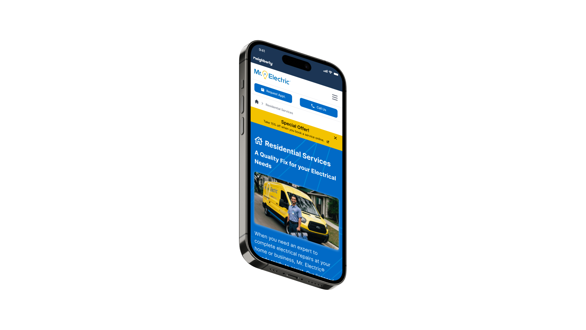
The final solution for Neighborly was a comprehensive Design System Language (DSL) that allowed for seamless collaboration across mobile and web applications. The DSL served as a foundation for creating a scalable UI kit, ensuring consistency and standardization across Neighborly's portfolio of brands. By implementing a streamlined process for validating and approving design decisions, the team was able to efficiently re-skin multiple brands, improving the overall user experience. The influence on key stakeholders to prioritize scalability resulted in a user-friendly brand website that met the needs of both the users and the business. Through these efforts, Neighborly achieved a cohesive and visually appealing design system that enhanced brand identity and customer satisfaction.
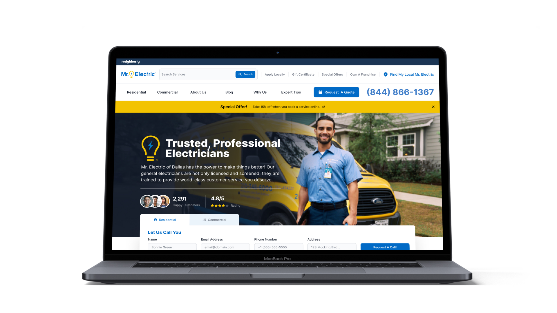
The reskinning of the hero section helped the users to visualize the form, CTAs and features in a better way.
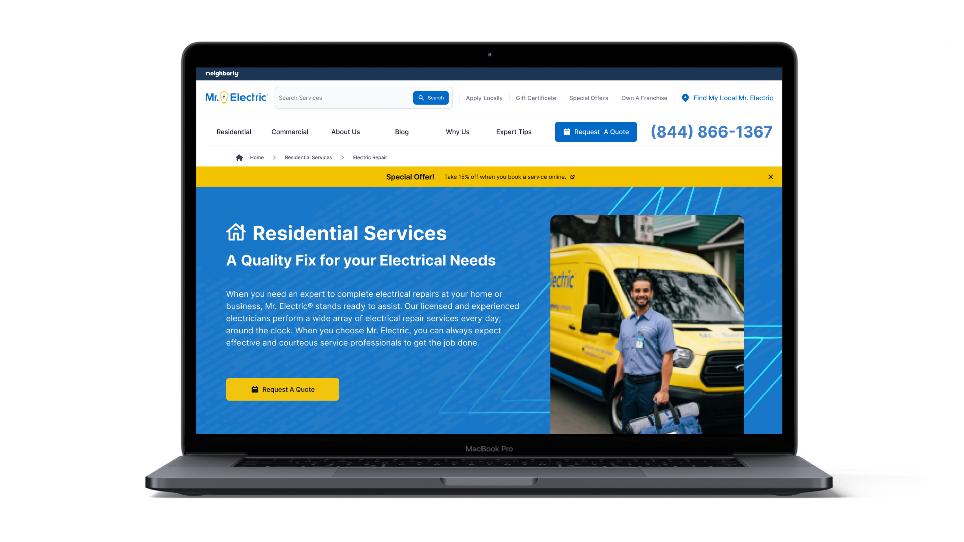
The brands had different approaches like Residential and Commercial services. Request a quote quickly within each section was a priority in the new designs.
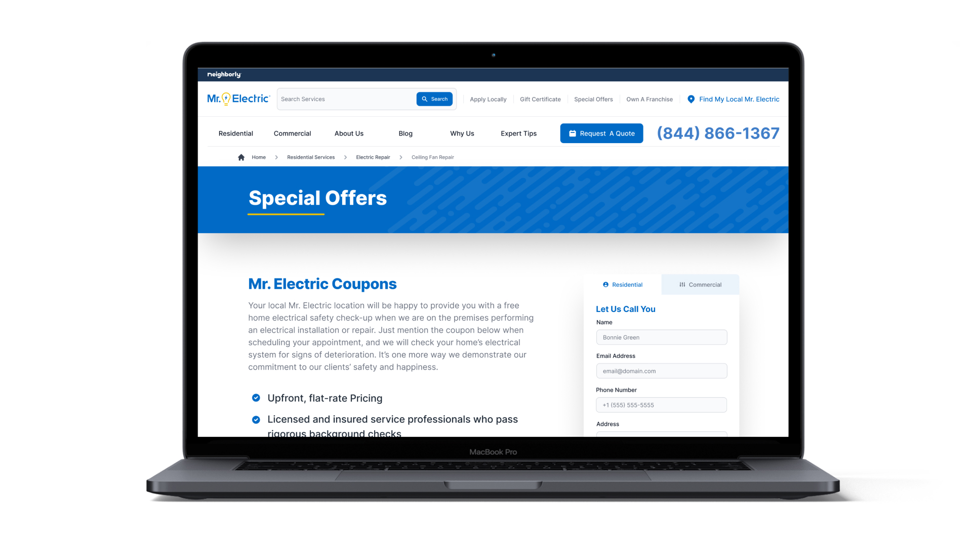
The reduction of the text on all the page helped the brands to increase engagement with the user. Set the forms in the right pages was benefical for the brands.
Takeaways
Specifically for this project the points that I like to highlight here are:
- Develop a Design System Language and devise a strategy to seamlessly collaborate across mobile and web applications.
- Implement a streamlined process to validate and approve design decisions for re-skinning multiple brands in an enterprise effort.
- Improve the user experience of the brand website, influence key stakeholders to create a scalable UI kit.
Overview
- Category Website
- Client Neighborly
- Time 8 months
- Tools Figma & WCAG 2.2
- Visit Website