Challenge
Design and develop a software platform that facilitates efficient communication and coordination among clients, truck drivers, and job site managers.
My role
As a user experience designer, I was responsible for designing and creating the iOS version of the application. Following the HIG, I created only the necessary components for the app's features.
Objective
The primary goal of the system was to provide a solution for tracking cement deliveries to one or more job sites. This solution includes real-time monitoring of delivery status, as well as the provision of proof of delivery documents for each delivery. With this system, users can stay informed about cement deliveries
Method Used
Discovery
During this phase, a set of Design Thinking workshops were delivered with Cemex stakeholders. The audience target was a selected group of decision-makers within the organization. These persons were experts in how Cemex works, its processes, and its pain points.
Some outputs were that the company received multiple complaints regarding the on-site deliveries. This is applied to cement and aggregates, the ideation session helped the team to identify all the features that would help the users with their specific tasks. Some of the top ideas were:
- The use of geofences for plants and job sites that allow delivery within the app.
- Let the Jobsite Manager sign with the app and send proof of delivery with the signature.
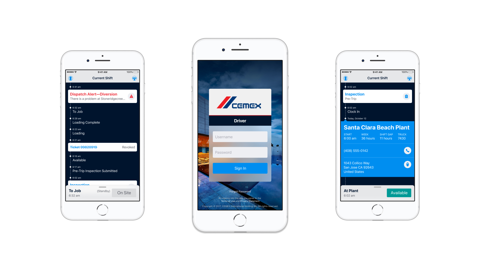
- Use for dispatch alerts to notify the drivers when a delivery has been canceled.
- Five-step security process that helps the driver to do a checklist before he starts his deliveries.
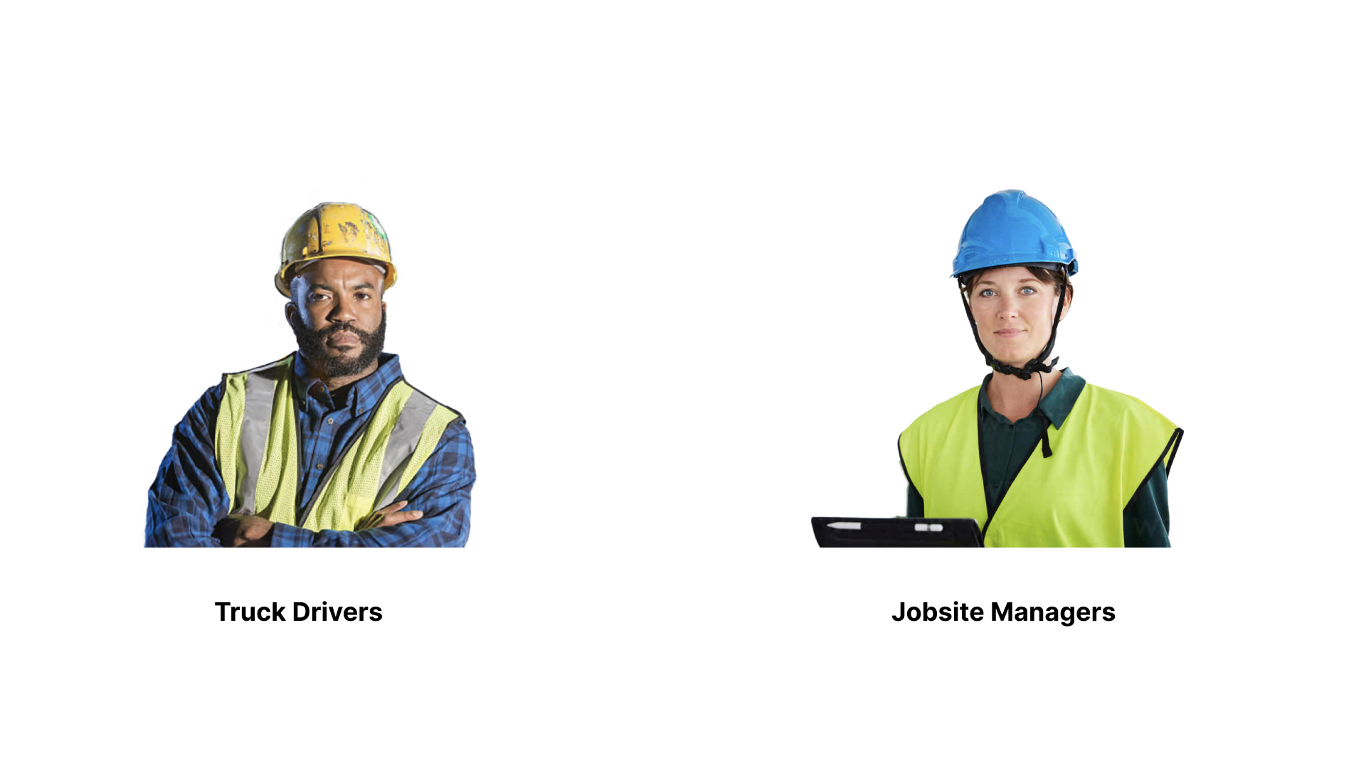
After the workshops I personally shadowed a few truck drivers in their day to day activities to identify all the insights that were not obvious in the interviews. The team identified two primary personas for this exercise: the truck driver and the job site manager.
Design
Cemex was currently undergoing a Digital Transformation initiative and adopting a User-Centered approach. However, the company did not yet established a specific Design language as part of this effort. The main challenge was to create and implement a Design language that fosters a sense of belonging among users. To achieve this, some design guidelines were adopted from Apple's HIG and Android Material Design. These guidelines were implemented across all platforms, which helped users quickly identify specific features in each channel.
A total of four applications were developed, the tracking app for both iOS and Android, including versions for drivers. The strategy employed was to have the iOS designers take the lead on designing the applications, and for the Android versions to replicate the components using the appropriate DSL.
Final Solution
Towards the end of building my application, I created a prototype on Invision and handed it off to the development team on Zeplin. After a few sprints, I transitioned from a UX Designer role to a QA role to ensure that the application had all the necessary features and that the changes made were minimal.
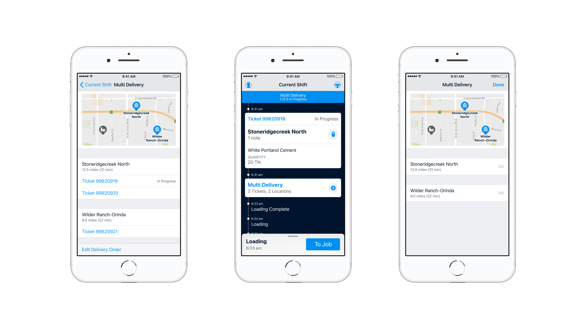
The multidelivery feature was one of the primary capabilities of this application. Also I got the idea to re-arrange the different jobsites based on the truck driver's expertise.
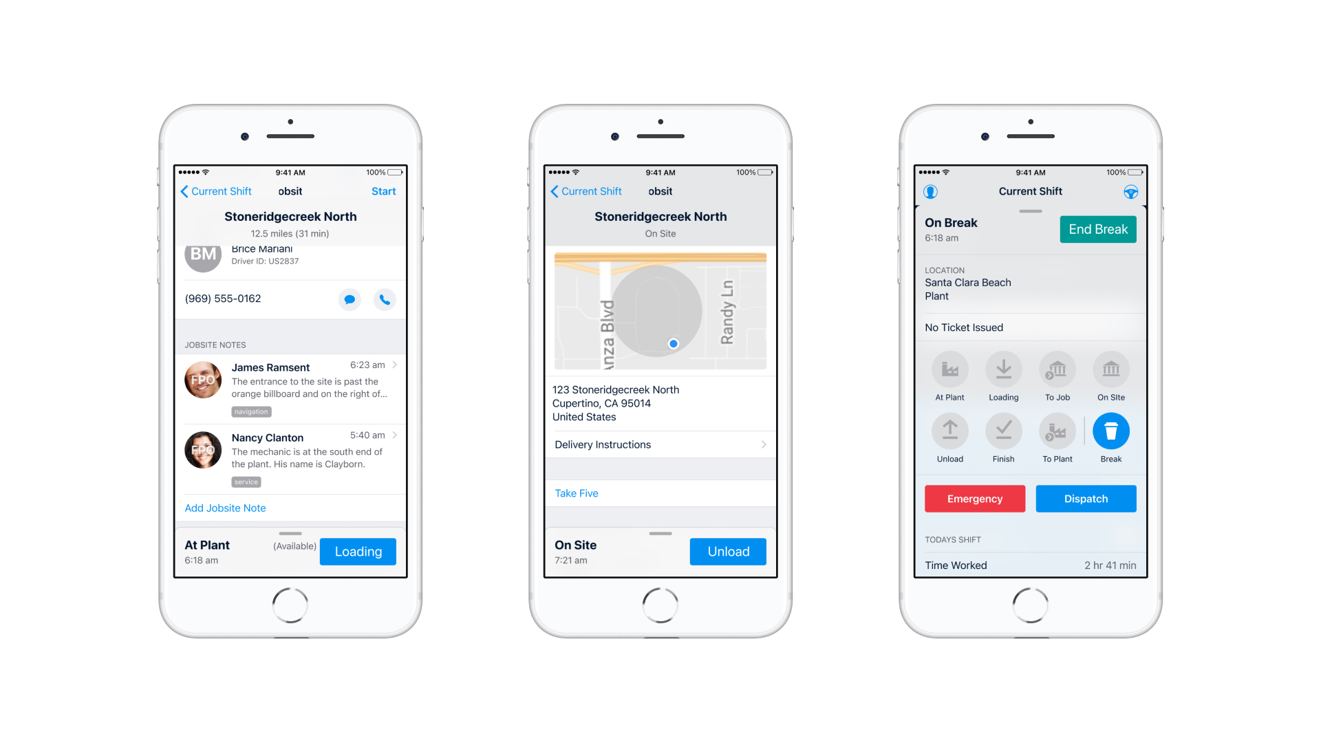
Show information to the drivers in the correct moment was a priority. Also, the team implemented a break feature that help the truck driver take a break and have in mind the final user in the whole process.
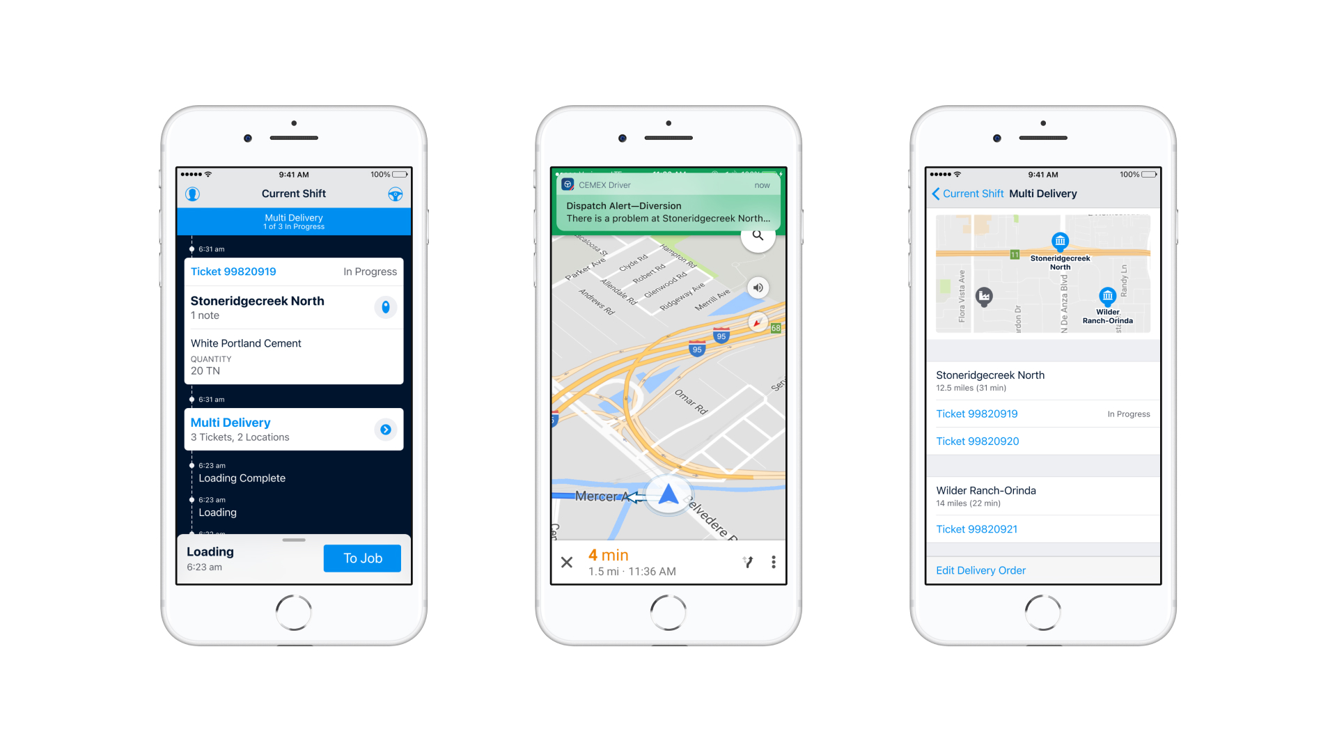
Other features like notifications and map integration was part of the app.
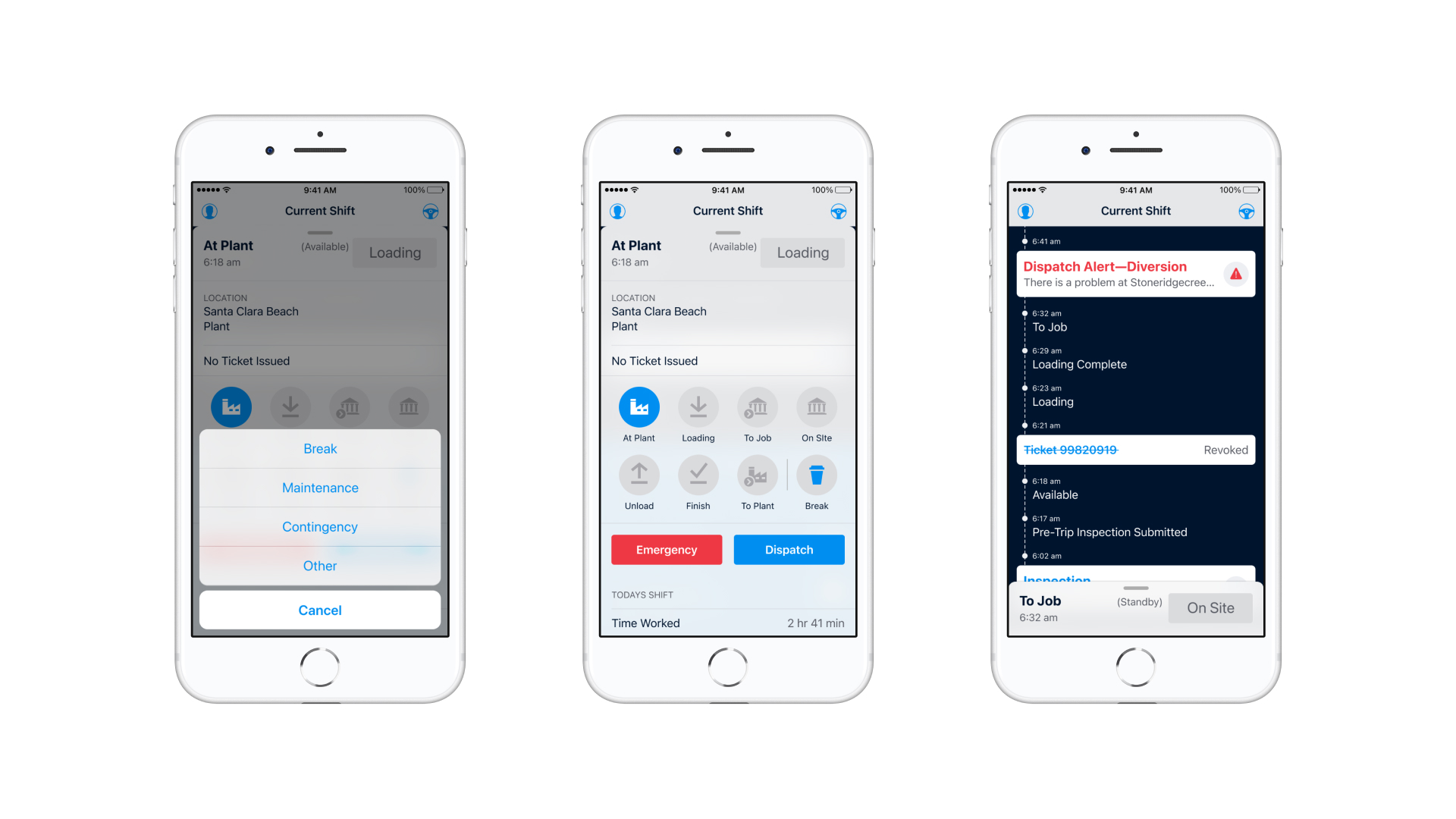
A card feature with all the possible actions for the truck driver was the core of the application. Giving the information and quick shortcuts for the different scenarios mapped on the journey maps.
Takeaways
- First thing, I worked on a project outside my expertise and collaborated with a diverse team to develop digital products. This experience taught me the importance of teamwork in achieving success.
- Second, I wish I had more user testing. I was unable to test the application often so I had to assume some insights from the drivers and continue with the designs. When the time came, I had multiple insights that, at the moment, were countless insights to take care of. I believe in the adage that says “fails quickly, and improves fast”.
- Third, during the Discovery phase, I had the priceless opportunity to go on a field research and even jump on the cement trucks. This experience helped me understand better how research plays a crucial role in the process of creating an application.
Overview
- Category Mobile design
- Client Cemex
- Time 11 months
- Tools Sketch, Photoshop, Illustrator, Apple HIG & Jira
- Visit Website
